Digital Expert’s Corner: Making Your Government Website Project Manageable
Our latest Digital Expert is City of San Angelo’s Public Information Officer, Anthony Wilson. In our Interview, Anthony shares his wisdom regarding website redesign and how to build a website that provides “information that is of interest, importance and impact to San Angelo’s citizens” with a small team AND launch early! According to Anthony, it all comes down to making your government website project manageable and taking it step-by-step.
What is the role of the website for the city?
We are a city of about 100,000 and our residents are a bit older and not the most tech savvy. When they need information, they have a tendency to look in the phone book and call the Public Information Officer’s office. The intent of the website is to replace the need to make that call.
Accordingly, the website serves as the information portal for the resident. If the citizen has a question, like “how do I adopt a cat” or “when does the council meet,” that’s where we want them to go. It’s informative. It’s interactive, so the resident can conduct city business, and it’s a tool for engagement. We also use social media. We actually have more Facebook users than the city of Austin. Yet, while social is both helpful and intriguing, we always want to drive the user back to the website for more information.
Did you design the website specifically for your core demographic?
We wanted the site to be user-friendly for everyone. The old site was such a confusing and frustrating maze. It would take four or five clicks to find anything. We wanted the new site to be easily navigated so the resident can find anything they need within one or two clicks. I DO think our core demographic benefited more from this ease-of-use (because they don’t like clicking around) than a twenty-something-year-old.
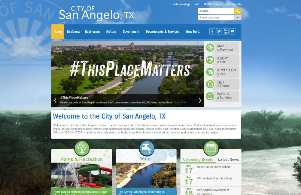
In your main navigation, you have a tab for residents, what was the thought behind this placement?
I wanted to be certain we didn’t overlook the main items that the average citizen was looking for like a list of annual events around the city. I think that when you are in the midst of a redesign it can be easy to get carried away with new, slick stuff and forget about what the ordinary citizen wants. Not only do we have the Residents tab we have the HOW DO I… as another quick way for residents to get what they need in two clicks.
I wanted to mention that our site also exposes interesting items for our visitors to do, like Fort Concho and the International Waterlily Collection. The town itself sprang from the fort. The old site had that old-timey look and feel. We wanted to change that so the visuals and palette are meant to reflect a vibrant and modern place to visit and live.
You accomplished a lot with a very small team, and — impressively, you launched early. How did you accomplish this?
Well, it was actually very cathartic to go in and spring-clean the old site by slashing away at pages. We consolidated information on pages in ways that make sense. Again, it was so that the user had fewer clicks. However, we didn’t just go thru and slash and burn. For instance, every department and division has its own page. That was important to us because if a resident needed a contact in a specific department, they had access to a name, a phone number and an email. I counseled our department heads not to provide an avalanche of information. Also, I requested that we all instill some discipline so that our resident didn’t have to scroll a page that was three yards long.
Four of us worked with Granicus on the design. Two from communications and two from IT. One of the IT members was very young and I welcomed that because it brought energy and a young-eye to the project. I was the project manager.
When you go into this process, it is daunting. It’s frightening to think about redoing your entire website. It could have easily overwhelmed us. But it didn’t, I am going to brag about the Granicus team. Our project manager was excellent. They walked us through the process, step by step. It was the proverbial “eating away at the elephant”, we just came in everyday and ate away at it. Before we knew it, we were done. We beat our timeline and launched early! For our team, we were amazed and proud that we tamed this beast.
Early! Wow! Typically, when we launch early it means the client was well prepared.
Yes, we had our four goals as our lodestar and I think that really helped as we kept going back to them. The goals were the site needed to be informative, interactive, navigable, aesthetically pleasing. And we only had four rather than eight. These goals really enabled us to set boundaries.
What are some tips you would give a city embarking on a website redesign?
First, don’t be intimidated. Compared to the competition, Granicus produces a better website! Set boundaries. Our old PIOs let departments do whatever they wanted on their pages. There was no consistency and didn’t look professional. We went so far as developing a template and had the departments use it. Limit the number of people who can publish to the website. We have five. We did that to ensure a professional sheen. Additionally, for budget reasons we did our own migration. It was great practice for us as when we were live we already knew how to use the site, and then it was easier for us to train. Because we did so much prep, I think we didn’t have some of the hiccups that some sites do when they launch. Also, check out other websites, for what you like and what you don’t like.
Thanks Anthony! There’s a lot of good advice here for organizations pondering a redesign.
If you are pondering a website redesign and wondering what type of prep work you should be doing, contact us for a free consultation!